IDEATION, CONCEPT, DESIGN
AND FUNCTIONALITY OF A USER
FRIENDLY RESTAURANT APP
• Sector: hospitality industry - food and drinks.
• Challange: Le clair stands as a distinctive family-owned culinary haven nestled in a charming suburban landscape Rooted in a commitment to delivering an authenticfrench dining experience, their culinary ethos revolves around the heartfelt mantra, "from our kitchen to your home" Unlike conventional restaurants with on-site dining, Le Clair exclusively caters through an efficient Pickup and Delivery service that needed to be updated from a phone call orders to online order with a user friendly mobile app.
• My role: UX designer, designing Le Clair’s app from conception to delivery.
• Responsibilities: Conducting interviews*, paper and digital wireframing, low and high-fidelity prototyping, conducting usability studies*, accounting for accessibility, and iterating on designs.
*Interviews and usability studies were conducted and recorded on real peopcle.
UNDERSTANDING
THE USER
• User research
• Personas
• Problem statements
• User journey maps
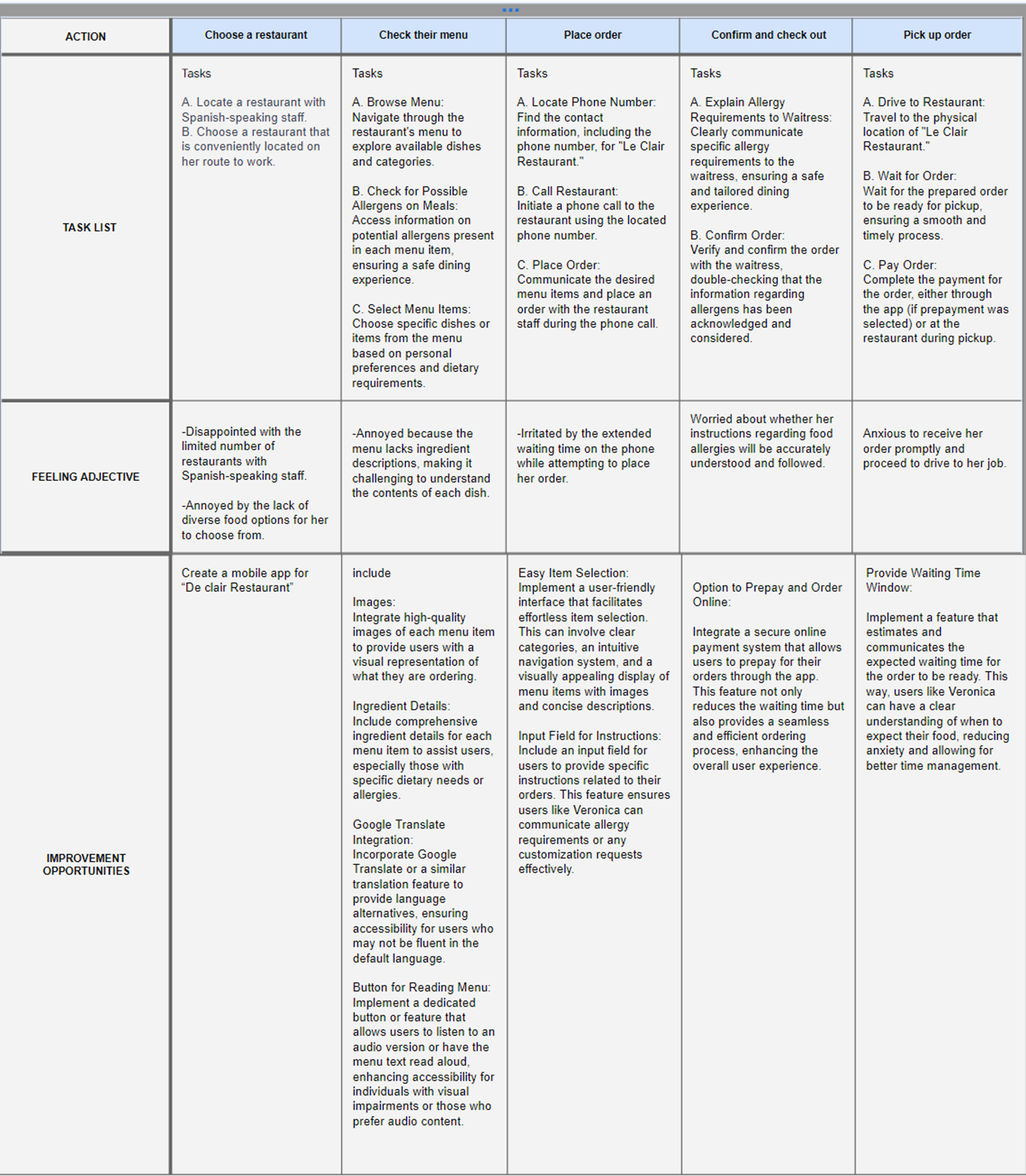
Pain Points
For this project, interviews were conducted, and empathy maps were created to comprehend the users for whom the app was being designed and to discern potential user needs. Through this research, a primary user group emerged: working adults who either lack the time to prepare meals or choose to utilize that time for alternative activities. This user group indicates that certain individuals refrain from cooking at home not solely due to time constraints but also because of factors such as fatigue, limited culinary abilities, lack of interest, and external influences that deter them from opting for in-person restaurant dining.


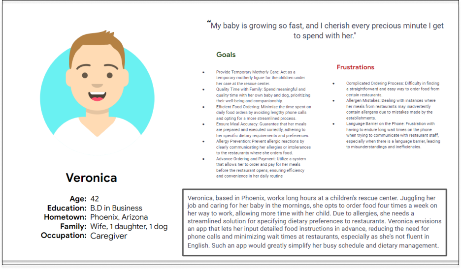
User journey map
Mapping Veronica's user journey highlighted the potential benefits of providing users with a dedicated Le Clair app. This app could streamline her experience, offering tailored solutions to meet her specific needs and preferences, ultimately enhancing overall user satisfaction and convenience.
STARTING
THE DESIGN
• Digital wireframes
• Low-fidelity prototype
• Usability studies
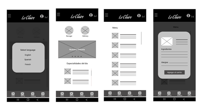
Paper Wireframes
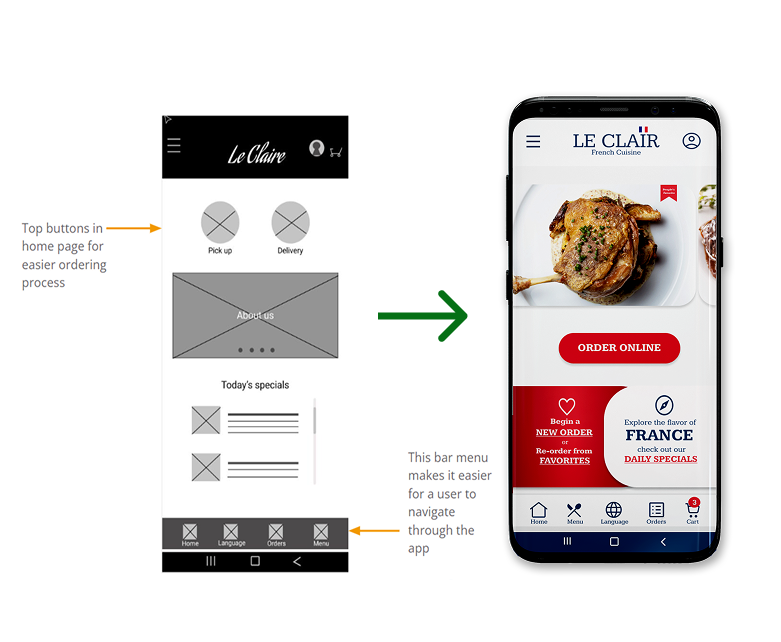
Draft of the preliminary concept for elements to be included in the digital wireframe. The design approach aims to create a streamlined and user-friendly ordering process, specifically tailored to address identified user pain points.
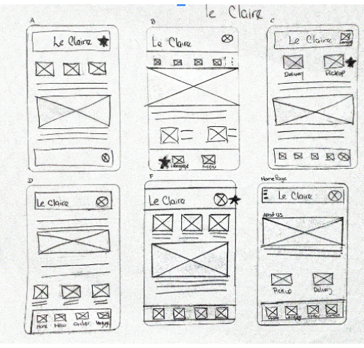
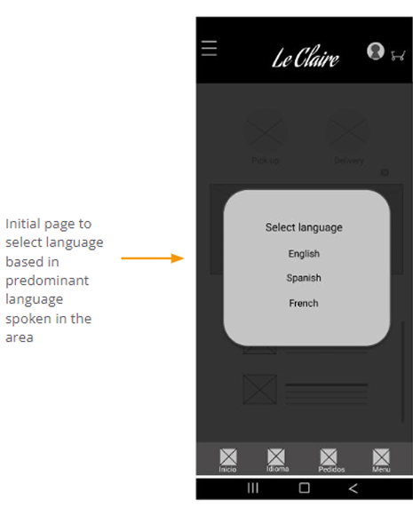
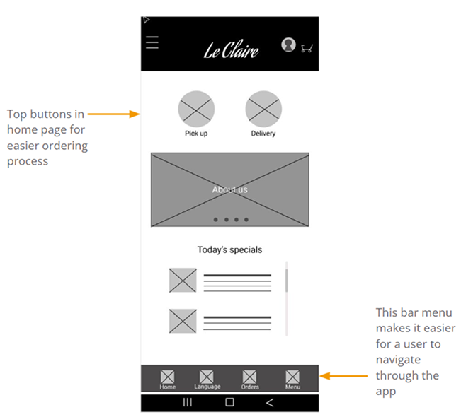
Digital wireframes In the initial design phase, I made sure to incorporate user research feedback to create screens that are straightforward and easy to understand.
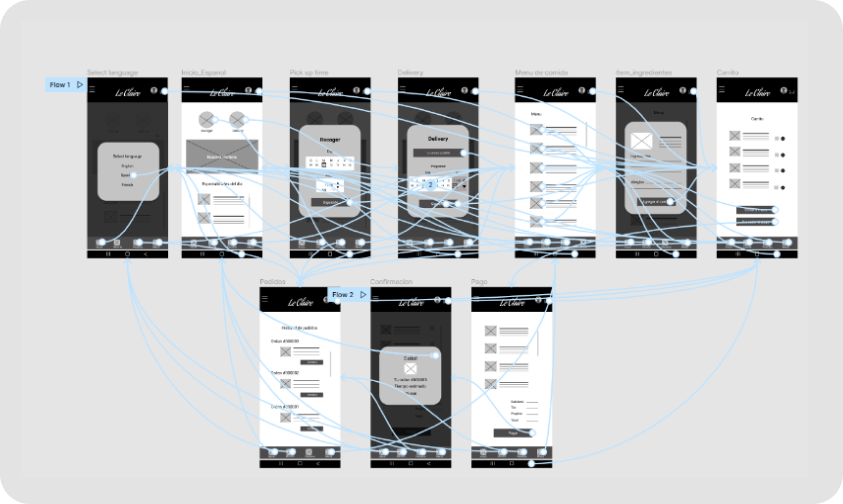
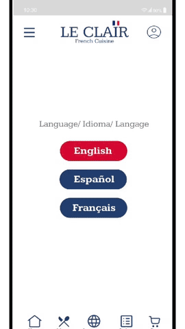
Low-fidelity
Prototype utilizing the finalized digital wireframes, developed a low-fidelity prototype. The main user journey established encompasses selecting a language (Spanish, aligning with the persona "Veronica"), proceeding with ordering, scheduling, choosing an item from the menu, adding specific instructions to that item, and ultimately completing the order.
Usability study: findings
Two rounds of usability studies were conducted. Insights from the first study significantly influenced the design's transition from wireframes to mockups. The second study, based on a high-fidelity prototype, revealed areas within the mockups that needed further refinement

REFINING
THE DESIGN
• Mockups
• High-fidelity prototype
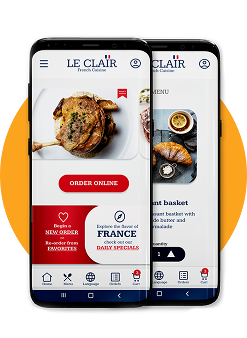
Mockups
Early designs effectively indicated the starting point for orders; however, they were criticized for excessive space utilization, limiting user focus to a single route and option. In response, the redesigned interface introduces three distinct ways to order, enhancing user flexibility:
1.
New Orders:
Allows users to initiate fresh orders, catering to those who prefer exploring new menu items.
2.
Favorites:
Provides a quick route for users to reorder from their favorire selections, addressing the desire for easy reordering.
3.
Past Orders:
Enables users to revisit and reorder from their historical orders, streamlining the process for recurrent selections. This revamped design aims to offer users a more versatile and accommodating ordering experience.
This revamped design aims to offer users a more vesatile and accommodating ordering experience
Usability Study Round 2 Findings
The second usability study underscored key user needs:
1. Recurrent Allergy Instructions:
Users expressed a strong need for a feature that allows them to add and save recurrent allergy instructions for their orders.
2. Language-Specific Instructions:
Users highlighted the importance of being able to input instructions in their own language, particularly concerning allergies.
3. Access to Favorites and Reordering:
Users emphasized the necessity of having easy access to their favorite items and the ability to reorder from their past orders.
Improvement Strategy:
1. Implement Recurrent Allergy Instructions:
Introduce a feature that enables users to save and reuse allergy-related instructions for efficiency in recurrent orders.
2. Multilingual Instruction Entry:
Enhance the app to allow users to input instructions in their preferred language, offering a personalized and inclusive experience.
3. Streamlined Access to Favorites and Past Orders:
Ensure prominent visibility for the "Favorites" and "Past Orders" sections, simplifying the process for users to access and reorder from their preferred selections.
Before usability study 2
After usability study 2
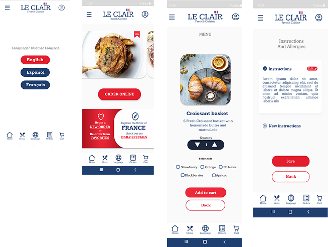
High-fidelity prototype showcased streamlined user flows for both PICKUP and Delivery orders. It also demonstrated an intuitive pathway to access the Order History feature, allowing users to easily re-order from their previous transactions.

Impact
The app significantly enhances users’ ordering experience by fostering a sense of confidence and reassurance. With intuitive features such as enlarged images and detailed descriptions, users can make informed decisions with ease, resulting in a smoother and more satisfying ordering process. This boost in confidence translates into greater trust and loyalty towards the app, driving overall user satisfaction and engagement.